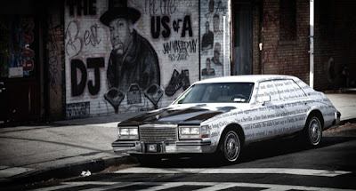
November 16, 2010 is the date NY rapper Jay-Z released his long awaited memoir entitled "Decoded". Currently, the book is listed at #3 on the New York Times Bestsellers List. You would think a big name like Jay-Z would have no problems selling this book based off the history of his record sales. Apparently, Jay-Z didn't want to take any chances, so he teamed up with Bing and creative agency Droga5 to create a huge viral marketing campaign. It was conceptualized as a scavenger hunt around New York. Check it out below. This campaign is serious.
Thursday, November 25, 2010
"Decoded" VIRAL Campaign
November 16, 2010 is the date NY rapper Jay-Z released his long awaited memoir entitled "Decoded". Currently, the book is listed at #3 on the New York Times Bestsellers List. You would think a big name like Jay-Z would have no problems selling this book based off the history of his record sales. Apparently, Jay-Z didn't want to take any chances, so he teamed up with Bing and creative agency Droga5 to create a huge viral marketing campaign. It was conceptualized as a scavenger hunt around New York. Check it out below. This campaign is serious.
Friday, November 19, 2010
INFOgraphics!
I searched some infographics to get inspiration for this upcoming project. Needless to say, I came across some really good ones and some really bad ones. Then, I came across some that I wasn't sure about. Here's an example...
I thought this was interesting because it discusses the outbreak history of swine flu, its different phases, the effects on humans, treatment in humans and piggies, and more. I also thought it was cute, which is probably why I was drawn to it. I think it works, but I also think some of the images aren't really necessary. Then again, the images add to the playfulness of a serious subject, and I think that's what the designer wanted to convey. I think I'm just torn. Click here to get a better view of this infographic.
Anywho, I came across a really bad infographic. One that I know is bad. Here it is.
Can you say YUCK? If I saw this in a publication, I would surely keep it moving. That is all about this one. If anyone wants a clearer view of this infographic, click here. Let me know what it's about. Thx!
Thursday, November 18, 2010
Sushi Anyone?
Are you a frequent consumer of sushi or Thai food? Well the product above may be just for you. Introducing.... My Hashi Chopsticks! They are reusable chopsticks you carry in a clear case and come in multiple colors that best fit your personality. From now on, you can go to an Asian food place and return those wooden chopstick to the server because you are a professional sushi eater! You only use the best chopsticks! How about that...
Tuesday, November 16, 2010
Kleenex for Dessert?
Kleenex has a new design for its tissue boxes featuring homemade desserts for the holiday season. The idea is to have customers place the tissues in the busiest areas of the home, since dessert draws people and families together during winter celebrations. I must say the boxes look divine, and I would be the one to think they are actual desserts. Wow, Kleenex is taking marketing to the next level. I like it!
Thursday, November 11, 2010
EFFECTIVE New Cigarette Packaging?
While watching the news this morning, I was a little creeped out by the new packaging the government wants to use for cigarettes. The idea of the new packaging is to display a visual warning of the harm cigarettes can do to a person instead of using the Surgeon's General Warning.
Immediately, I thought of the images Amy wanted to use in her organ donor campaign. Although the messages between Amy's campaign and the new cigarette boxes are different, I now understand how certain images can create uneasiness in an audience. But then again, maybe smokers need to see the dangers and become uneasy with seeing such images. That might be the beginning of their road to quitting.
I know that tobacco companies are not thrilled with the idea of sharing their packaging with the image of a dude in a coffin. Let's see where this goes...
Tuesday, November 9, 2010
Product Package & Story
I found this product package design on my new favorite blog site http://www.thedieline.com. I immediately saw this design and thought this is not your average milk. It's more fun and playful, and because of this, I think it may be targeted to kids. Also, I like how the design include the different colors that are recognizable to consumers as the colors associated to the type of milk. Red is related to whole milk, blue is related to 2% reduced fat, and so on. Another thing is that the actual bottle is unlike the typical carton or jug we see milk come in. This tells me that this milk is of higher quality.
If I thought I could afford this milk, I would buy it. Just sayin'
If I thought I could afford this milk, I would buy it. Just sayin'
Monday, November 8, 2010
For my fellow WINE-Os...
Looky here... a combo wine glass storage rack and wine bottle holder. It is called the Insta Wine Rack by Modern Cellar. It can hold two wine bottles and up to six glasses. I like the simple, yet modern design of this. Check out the website if interested. I am here to pass the word.
Saturday, November 6, 2010
Narrative- The Boondocks
I included a comic strip from 2006 to this post.
Friday, November 5, 2010
Alien and Vampire LOVE
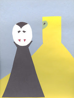
As part of show and tell from last week, we were to create a storyboard using only glue, scissors, and construction paper. The result is below. See if you can tell what is going on in this beautiful story.
This is just beautiful :)
This is just beautiful :)
Designing OLD Furniture
Everyone has an item in their home that could be thrown out, but it still works, so it stays. Most likely, it is not appealing to the eye. Well, let's take a cue from this Design Sponge post and put a little of our design savvy into sprucing up that unwanted item.
Check out the before... an old dining room set with mixed matched chairs.
And the after...
Look at how simple this makeover was. The word "EAT." was added to the edge of the table in a white serif typeface. The white base and legs were brightened to match "EAT." and to coordinate with the white chairs.
Pretty cool, but probably not for me.
Tuesday, November 2, 2010
Watching the design of LETTERS
I was told about the Design Sponge blog and a post it had with designer/artist Luca Barcellona hand writing letters for the "Legacy of Letters" Italian tour. This guy does an awesome job of creating his forms. It takes him five minutes to do what would take me a whole day. Now, that's talent.
To check out the video, go to http://www.designspongeonline.com/2010/10/talk-about-gorgeous-letters-luca-barcellona-video.html.
Enjoy!
To check out the video, go to http://www.designspongeonline.com/2010/10/talk-about-gorgeous-letters-luca-barcellona-video.html.
Enjoy!
Subscribe to:
Comments (Atom)


